
Note
Go to the end to download the full example code.
Plotting the Squashing Factor#
This example demonstrates how to use and plot the compute_q_on_surface()
to visualize key topology and morphology metrics of the magnetic field.
The compute_q_on_surface() combines expansion_factor() with
calc_jacobian()andcalc_q()usingmap_pt_forward()ormap_pt_backward()to calculate the squashing factor.
For a more complete description of the squashing factor, see Titov et al. 2007. Generally, the squashing factor indicates how much a given flux tube distorts. Other ways to imagine the squashing factor, Q, includes places where current sheets are likely (but not guaranteed) to form as high Q lines indicate quasi-separatrix layers (QSLs). Alternatively, high Q lines indicate different magnetic flux domains.
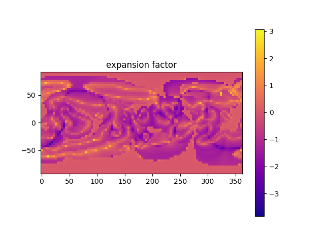
Additionally, this plots expansion_factor(), critical to models such as
WSA (see Wang & Sheeley 1990,
Arge & Pizzo 2000, and
Arge et al. 2004).
import os
from psi_data import fetch_mas_data
import numpy as np
import matplotlib.pylab as plt
from mapflpy.scripts import map_pt_forward, expansion_factor, compute_q_on_surface
The squashing factor, Q, is a measure of the topology of the magnetic field. So, let’s read in magnetic field files. We’re loading in from a CORHEL-MAS thermodynamic MHD calculation for CR2282. These aren’t currently standard datasets in mapflpy or psi-io, so we’re fetching them manually and placing them in the default cache location.
files = fetch_mas_data(domains="cor", variables="br,bt,bp,t")
magnetic_field_files = files.cor_br, files.cor_bt, files.cor_bp
As a quick look, we can immediately calculate Q specifying only the magnetic field files and visualize the output.
# compute Q
squashing_factor_default = compute_q_on_surface(magnetic_field_files)
# plot Q
ax = plt.figure().add_subplot()
q_map = ax.pcolormesh(np.rad2deg(squashing_factor_default.p), 90 - np.rad2deg(squashing_factor_default.t),
                      np.log10(squashing_factor_default.q),
                      cmap='Grays')
ax.set_aspect("equal", adjustable="box")
ax.set_title('Log$_{10}$ Q')
plt.colorbar(q_map)
plt.show()
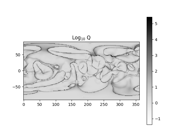
fwd mapping
That should run fairly quickly, as the resolution is a little bit more than 1 degree. However, we can customize the map. We can, for example, change the direction of mapping to “bwd” and choose a trace_radius of 3. We can either specify a [start, end] for theta and phi with t_range and p_range, or specify our own array with t_arr and p_arr. We are intentionally picking a low resolution so this runs fast, you should use more points!
squashing_factor_3_bwd = compute_q_on_surface(magnetic_field_files, direction='bwd', nproc=4, trace_radius=3,
                                              p_arr=np.linspace(0, 2 * np.pi, 80), t_arr=np.linspace(0, np.pi, 40))
# and visualizing:
ax = plt.figure().add_subplot()
q_map = ax.pcolormesh(np.rad2deg(squashing_factor_3_bwd.p), 90 - np.rad2deg(squashing_factor_3_bwd.t),
                      np.log10(squashing_factor_3_bwd.q),
                      cmap='Grays')
ax.set_aspect("equal", adjustable="box")
ax.set_title('Log$_{10}$ Q')
plt.colorbar(q_map)
plt.show()
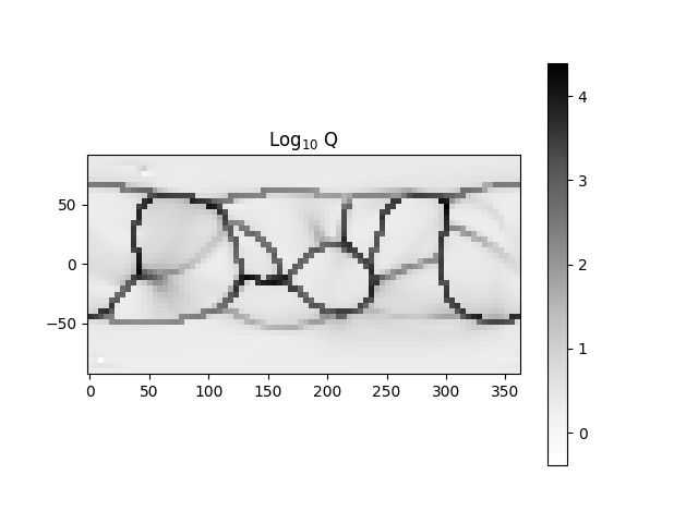
bwd mapping
This wrapper makes it easy to get the squashing factor. If we’re interested in just say, the expansion factor, we can plot that.
# We first need to calculate a mapping on a set of given points
p_to_trace = np.linspace(0, 2 * np.pi, 100)
t_to_trace = np.linspace(0, np.pi, 50)

# let's  map and get the expansion factor
mapping = map_pt_forward(*magnetic_field_files, p_to_trace, t_to_trace)
ef, p_ef, t_ef = expansion_factor(magnetic_field_files, mapping, 3, p_to_trace, t_to_trace)

# and now we can visualize
ax = plt.figure().add_subplot()
ef_map = ax.pcolormesh(np.rad2deg(p_to_trace), 90 - np.rad2deg(t_to_trace), np.log10(ef).T,
                       cmap='plasma')
ax.set_aspect("equal", adjustable="box")
ax.set_title('expansion factor')
plt.colorbar(ef_map)
plt.show()
Total running time of the script: (0 minutes 13.499 seconds)